Cody ranks the City Edition jerseys for all 30 NBA teams. What are Cody’s qualifications for such a ranking you might ask? He worked for years at an upscale men’s clothing store, so he’s actually the perfect person to take this on. On the other hand, after he ranked Houston over Memphis and Utah… it’s hard to say for sure.
Every year the NBA decides to honor the hometowns of their 30 teams. They release a whole slate of new uniforms known as the CIty Edition. It’s also an excellent way to get the citizens of those metropolitan areas to purchase a new piece of merchandise. Still, who doesn’t like alternate unis! We’re a quarter of the way into the season now and pretty much every team has debuted their City jerseys. They’ve been on the internet for a while, but I wanted to see how they looked in game action to really make my concrete rankings. Without further ado, my personal opinions on the design choices of all 30 options, ranked in descending order:
30. Cleveland Cavaliers
So I’ve struggled to enjoy any iteration of the Cavs jerseys since they wore light blue and orange. But this is an atrocity. They’re trying to honor Cleveland’s rock ties, but it just looks like they’re trying to kidnap someone.

29. Sacramento Kings
The Kings took a walk down memory lane to make this year’s jersey. I don’t think the final product matches up to the sum of its parts. Like Cleveland, it is also too many parts. Narrow down on a theme and stick with it.

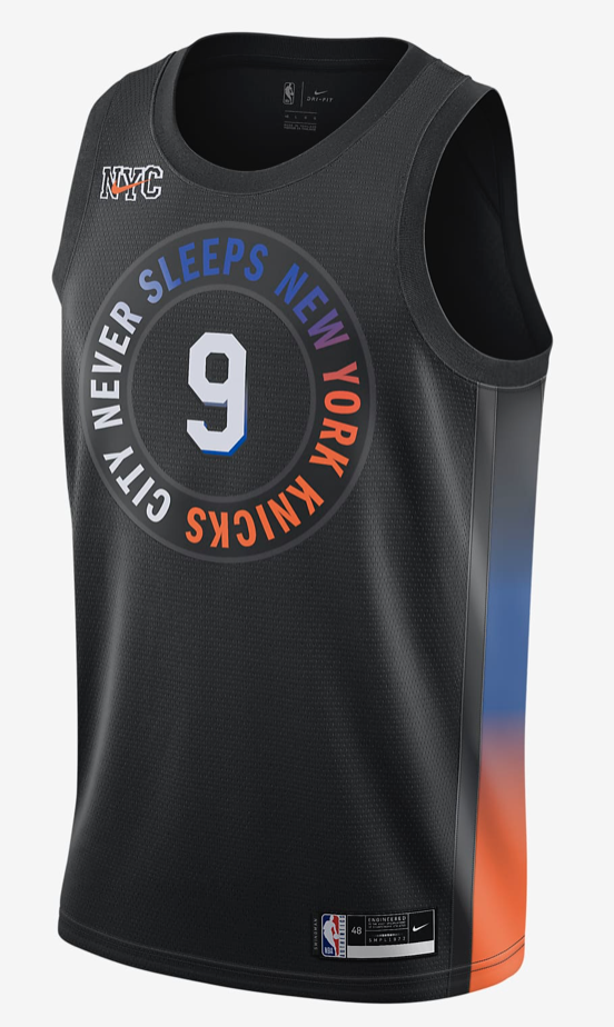
28. New York Knicks
The Knicks have a vibrant color scheme and some of the best standard set of unis in the league. So they really went in a different direction here. They’ve muted everything. I do like the call back to one of New York’s nicknames, but even that is hard to read. This is not good.
27. Los Angeles Lakers
I totally support honoring Elgin Baylor, which is what the Lakers say this jersey is doing—since he is one of the more underrated players in league history. But this jersey just falls flat. Not to mention, a team honoring a city they ditched doesn’t sit well with me. Stay tuned.

26. Golden State Warriors
Remember when I said that I don’t appreciate teams honoring a city they ditched? This is a big one. They priced out their rabid normal fans and then moved the team. Now those fans can spend more money to buy a shirt that represents them. That being said, the design itself is a cool update on those early 2000s teams. Could be much higher.

25. Toronto Raptors
I like the black and gold scheme even if it is a little grating that it is tied to Drake’s brand. The design is clear and the shorts (not pictured) are cool. But when you have the richness of history that the Raptors do, I think there are cooler possibilities. Purple dinosaurs!

24. Washington Wizards
Mostly boring. I really liked the marble design they had a couple of years ago. The gray feels…too gray? I really like the stars and stripes on the side and the DC logo is so cool. Especially if the team didn’t have the nickname of Wizards.

23. Miami Heat
The Heat have been in the top spot in this poll of one for the last several years. Their Miami Vice theme is awesome. Unfortunately, I am not a fan of gradient jerseys, especially vertically oriented ones. They also didn’t go with a white font, which would have really hammered home the trans flag idea.

22. Utah Jazz
I like this design a lot. Though it falls victim to a similar problem to the Miami one, the red rocks version is much better. It has a cohesive theme and is visually interesting. I don’t agree with every team just throwing a black alternate around.

21. Memphis Grizzlies
The Grizz have one of the best throwbacks in the league with their teal gem. I like this design and I don’t have any real knocks on it. I simply happen to like others’ more. That is why it is in the most forgettable tier of this ranking.

20. Houston Rockets
I’m a sucker for baby blue. Tying it into the history of Houston is cool too. I have to say that this jersey wasn’t particularly slimming on James Harden. It’s a good jersey. It is a plain good jersey.

19. Oklahoma City Thunder
I like the dynamic design of diagonal stripes. The Thunder’s color scheme has always felt like a mishmash to me. This version actually cleans it up in my opinion, letting all these bright colors function as accents. But something is still missing.

18. Indiana Pacers
Another updated take on a classic. This harkens back to the jerseys the Pacers wore while contending in the Eastern Conference year after year. The pinstripes feel right for Indiana. I love the subtle accent of white in the side stripes. Solid.

17. Orlando Magic
The Sunshine State and the Citrus industry gets a shout out here. They get a bump in my rankings because how often does a team honor fruit? I also think they are just a fun alternative to what I consider a fairly boring standard uniform set. Orange is underutilized.

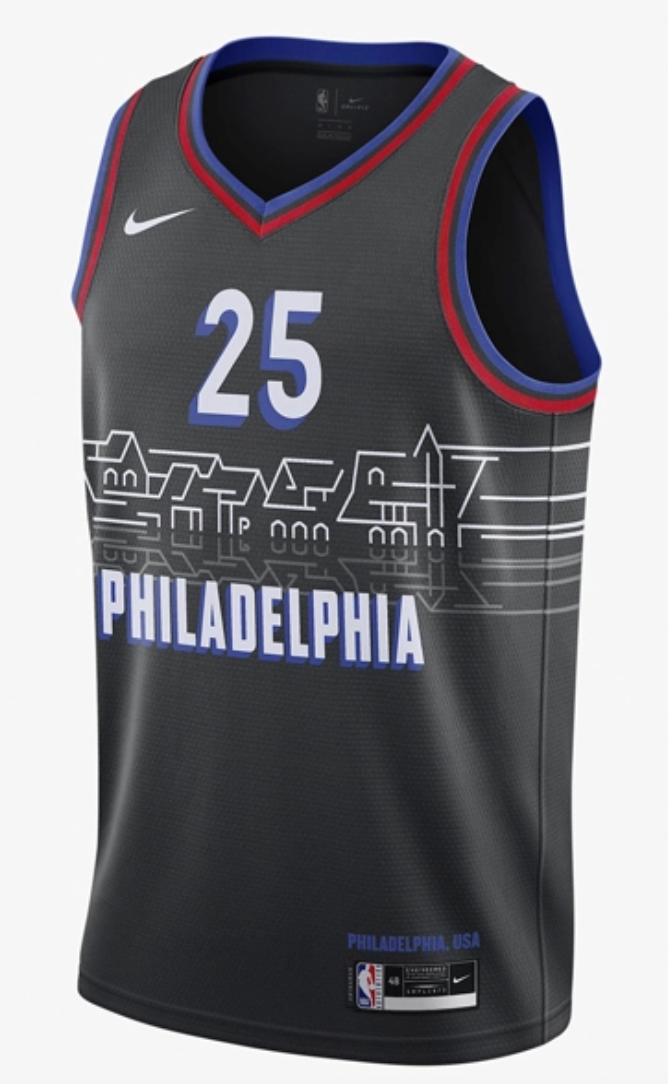
16. Philadelphia 76ers
My favorite part about this jersey is the reflection of the skyline in this river effect. That’s dope. The 76ers have a history of black unis and this one can be held right up there with the rest.
15. Detroit Pistons
Motor City is a cool nickname. I like when teams use their cool nicknames on these alternate jerseys. The Pistons have a simple and easy color scheme. I appreciate the rounded logo idea. All that adds up to it falling pretty much right in the middle of my list.

14. Denver Nuggets
This is a unique shade of red. If they had gone a shade brighter, it would have been significantly worse. A shade darker wouldn’t have been right either. I guess the billion dollar machine at Nike knew what it was doing. I love the mountains and Denver cityscape imagery. If they aren’t going to go with the iconic rainbow design, then this is good.

13. Los Angeles Clippers
I appreciate the idea of partnering with local artists. I appreciate doing something drastically different from your normal design. Black and white always works. Not much else to say. Kawhi in particular looks great in this one.

12. Minnesota Timberwolves
I had disliked pretty much every iteration of Timberwolves jerseys that have ever been made. Then they dropped this gem. I love the star motif for the North Star State. I love the simplicity. I even appreciate their use of their unusual neon green accent here. All around good choices. I would make the star on the chest a little bigger.

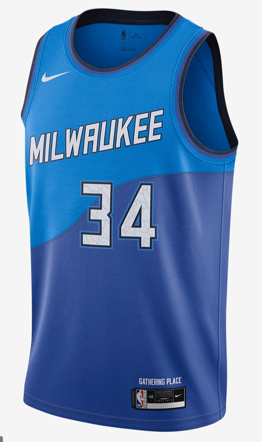
11. Milwaukee Bucks
The Bucks in blue is a big change. Reading about how it relates to Milwaukee’s significance as the land of water pulls it together. I appreciate the wave design. It somehow looks really cohesive. The shades of blue really pop. It jumped out at me as I was researching.
10. Chicago Bulls
The Bulls have maybe the best standard uniform set in the league. So an alternate really has to bring it. I think this one does. The font is fantastic and grounded in local culture. I don’t know what is happening on the sides, but I like it. They chose the perfect shade of gold and red that is less vibrant than you might expect, yet I believe it helps the aesthetic.

9. Brooklyn Nets
Another team that is honoring a local artist. They made the right call going with almost a charcoal color rather than a true black as the base. I’m really digging this as a tweak on their usual black away jerseys. One thing that is odd is that they are wearing the tie dye throwbacks much more.

8. Phoenix Suns
This is a dope jersey. Expanding beyond Phoenix to encapsulate the greater valley area is a cool idea. I love everything about this. The font, the sunrise visual, and the black base mimicking the desert night, it’s all fantastic.

7. New Orleans Pelicans
Hot take alert: This should be the Pelicans’ primary jersey. I freaking love it. The fleur de lis icons are cool. I like the bold red shoulder stripe and the blue waist stripe. It is so clean. Who needs words? Horizontal stripes on the body type of a Zion is generally frowned upon, but hey, it works.

6. Portland Trailblazers
Another team that has had a lot of dope alternates. This one feels like a real breath of fresh air even up against those. Honoring the Native tribes that lived on the land first and the use of color and topography are unique elements. All of these parts that may feel disparate really gel in a fun way.

5. Boston Celtics
I am in the camp that hates every and all Celtics alternate jerseys. Nothing can beat their classics. However, they succeeded this year in winning my heart. Modeling the jersey after the championship banners is a great flex. The fact that it is a subtle tweak on their usual unis is also a bonus.

4. Atlanta Hawks
Getting together with the estate of Martin Luther King Jr. to come up with an approved concept is awesome. It also helps that the design they came up with is great. It is a better version of what the Raptors did. The white really helps pull it all together. Honoring MLK, who was born in Atlanta, is just a classy move all around.

3. Dallas Mavericks
When I first saw this design, I said out loud (to no one), “holy shit.” I don’t know the significance of these choices, but I don’t care. This is damn majestic. And since Luka Doncic is a basketball angel, I think it totally fits. I just…I love it.

2. Charlotte Hornets
I can’t remember ever seeing a basketball team use mint as a main color. I didn’t know it was something that I needed in my life. I am so into it. The color combination is perfect. The mint jumps out and the gold settles in nicely. Using the pinstripe motif is a classic touch. I just love this jersey.

1. San Antonio Spurs.
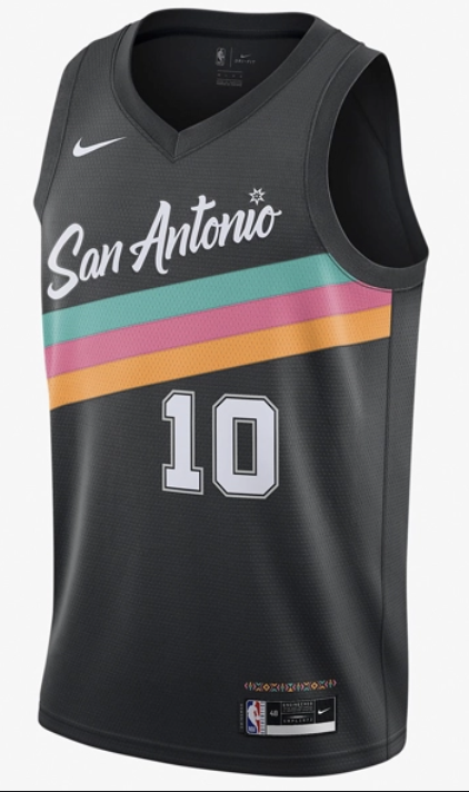
I mean, these are perfect. They’re everything I want in an alternate uniform. The font is refreshing in contrast to the standard block letters, they use a daring dash of color that is a throwback to their fiesta accents of the 90s, and it’s not gaudy at all.
